R version 4.2.2 (2022-10-31)
Platform: x86_64-apple-darwin17.0 (64-bit)
Running under: macOS Big Sur ... 10.16

Matrix products: default
BLAS:   /Library/Frameworks/R.framework/Versions/4.2/Resources/lib/libRblas.0.dylib
LAPACK: /Library/Frameworks/R.framework/Versions/4.2/Resources/lib/libRlapack.dylib

locale:
[1] en_US.UTF-8/en_US.UTF-8/en_US.UTF-8/C/en_US.UTF-8/en_US.UTF-8

attached base packages:
[1] stats     graphics  grDevices utils     datasets  methods   base

loaded via a namespace (and not attached):
 [1] Rcpp_1.0.9        here_1.0.1        lattice_0.20-45   png_0.1-8
 [5] rprojroot_2.0.3   digest_0.6.30     grid_4.2.2        lifecycle_1.0.3
 [9] jsonlite_1.8.4    magrittr_2.0.3    evaluate_0.18     rlang_1.0.6
[13] stringi_1.7.8     cli_3.4.1         rstudioapi_0.14   Matrix_1.5-1
[17] reticulate_1.26   vctrs_0.5.1       rmarkdown_2.18    tools_4.2.2
[21] stringr_1.5.0     glue_1.6.2        htmlwidgets_1.6.0 xfun_0.35
[25] yaml_2.3.6        fastmap_1.1.0     compiler_4.2.2    htmltools_0.5.4
[29] knitr_1.41
usingInteractiveUtilsversioninfo()
1 Overview of statistical/machine learning
In this class, we use the phrases statistical learning, machine learning, or simply learning interchangeably.
1.1 Supervised vs unsupervised learning
Supervised learning: input(s) -> output.
Prediction: the output is continuous (income, weight, bmi, …).
Classification: the output is categorical (disease or not, pattern recognition, …).
Unsupervised learning: no output. We learn relationships and structure in the data.
Clustering.
Dimension reduction.
1.2 Supervised learning
Predictors\[
X = \begin{pmatrix} X_1 \\ \vdots \\ X_p \end{pmatrix}.
\] Also called inputs, covariates, regressors, features, independent variables.
Outcome\(Y\) (also called output, response variable, dependent variable, target).
In the regression problem, \(Y\) is quantitative (price, weight, bmi).
In the classification problem, \(Y\) is categorical. That is \(Y\) takes values in a finite, unordered set (survived/died, customer buy product or not, digit 0-9, object in image, cancer class of tissue sample).
We have training data \((\mathbf{x}_1, y_1), \ldots, (\mathbf{x}_n, y_n)\). These are observations (also called samples, instances, cases). Training data is often represented by a predictor matrix \[
\mathbf{X} = \begin{pmatrix}
x_{11} & \cdots & x_{1p} \\
\vdots & \ddots & \vdots \\
x_{n1} & \cdots & x_{np}
\end{pmatrix} = \begin{pmatrix} \mathbf{x}_1^T \\ \vdots \\ \mathbf{x}_n^T \end{pmatrix}
\tag{1}\] and a response vector \[
\mathbf{y} = \begin{pmatrix} y_1 \\ \vdots \\ y_n \end{pmatrix}
\]
Based on the training data, our goal is to
Accurately predict unseen outcome of test cases based on their predictors.
Understand which predictors affect the outcome, and how.
Assess the quality of our predictions and inferences.
1.2.1 Example: salary
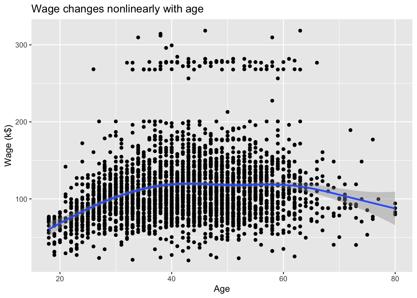
The Wage data set collects the wage and other data for a group of 3000 male workers in the Mid-Atlantic region in 2003-2009.
Our goal is to establish the relationship between salary and demographic variables in population survey data.
Since wage is a quantitative variable, it is a regression problem.
# Load the pandas libraryimport pandas as pd# Load numpy for array manipulationimport numpy as np# Load seaborn plotting libraryimport seaborn as snsimport matplotlib.pyplot as plt# Set font size in plotssns.set(font_scale =2)# Display all columnspd.set_option('display.max_columns', None)# Import Wage dataWage = pd.read_csv("../data/Wage.csv", dtype = {'maritl':'category', 'race':'category','education':'category','region':'category','jobclass':'category','health':'category','health_ins':'category' } )Wage
      year  age            maritl      race        education  \
0     2006   18  1. Never Married  1. White     1. < HS Grad
1     2004   24  1. Never Married  1. White  4. College Grad
2     2003   45        2. Married  1. White  3. Some College
3     2003   43        2. Married  3. Asian  4. College Grad
4     2005   50       4. Divorced  1. White       2. HS Grad
...    ...  ...               ...       ...              ...
2995  2008   44        2. Married  1. White  3. Some College
2996  2007   30        2. Married  1. White       2. HS Grad
2997  2005   27        2. Married  2. Black     1. < HS Grad
2998  2005   27  1. Never Married  1. White  3. Some College
2999  2009   55      5. Separated  1. White       2. HS Grad

                  region        jobclass          health health_ins   logwage  \
0     2. Middle Atlantic   1. Industrial       1. <=Good      2. No  4.318063
1     2. Middle Atlantic  2. Information  2. >=Very Good      2. No  4.255273
2     2. Middle Atlantic   1. Industrial       1. <=Good     1. Yes  4.875061
3     2. Middle Atlantic  2. Information  2. >=Very Good     1. Yes  5.041393
4     2. Middle Atlantic  2. Information       1. <=Good     1. Yes  4.318063
...                  ...             ...             ...        ...       ...
2995  2. Middle Atlantic   1. Industrial  2. >=Very Good     1. Yes  5.041393
2996  2. Middle Atlantic   1. Industrial  2. >=Very Good      2. No  4.602060
2997  2. Middle Atlantic   1. Industrial       1. <=Good      2. No  4.193125
2998  2. Middle Atlantic   1. Industrial  2. >=Very Good     1. Yes  4.477121
2999  2. Middle Atlantic   1. Industrial       1. <=Good     1. Yes  4.505150

            wage
0      75.043154
1      70.476020
2     130.982177
3     154.685293
4      75.043154
...          ...
2995  154.685293
2996   99.689464
2997   66.229408
2998   87.981033
2999   90.481913

[3000 rows x 11 columns]
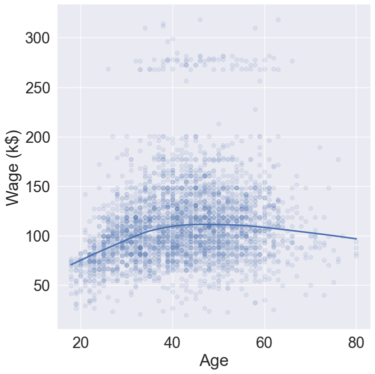
# Plot wage ~ agesns.lmplot( data = Wage, x ="age", y ="wage", lowess =True, scatter_kws = {'alpha' : 0.1}, height =8 ).set( xlabel ='Age', ylabel ='Wage (k$)' )
Figure 1: Wage changes nonlinearly with age.
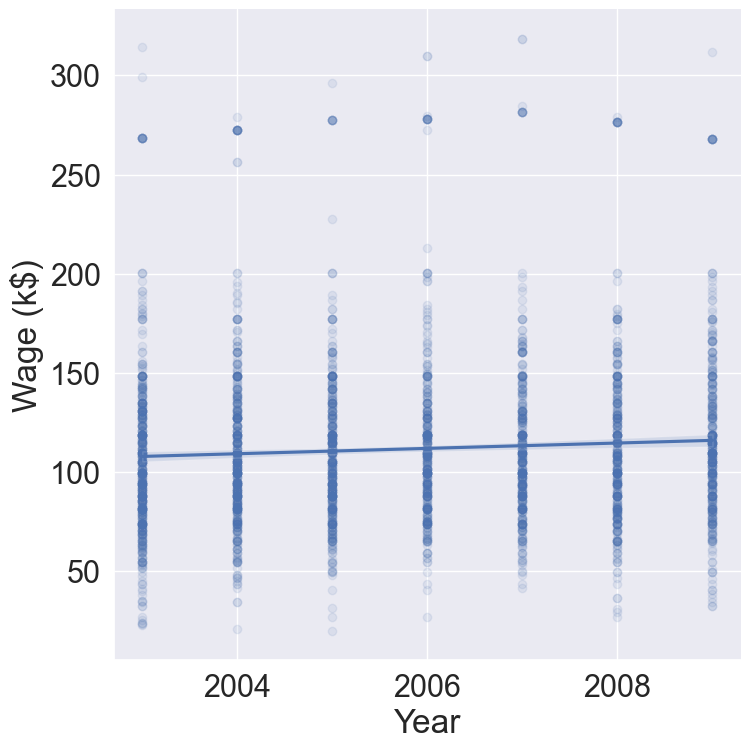
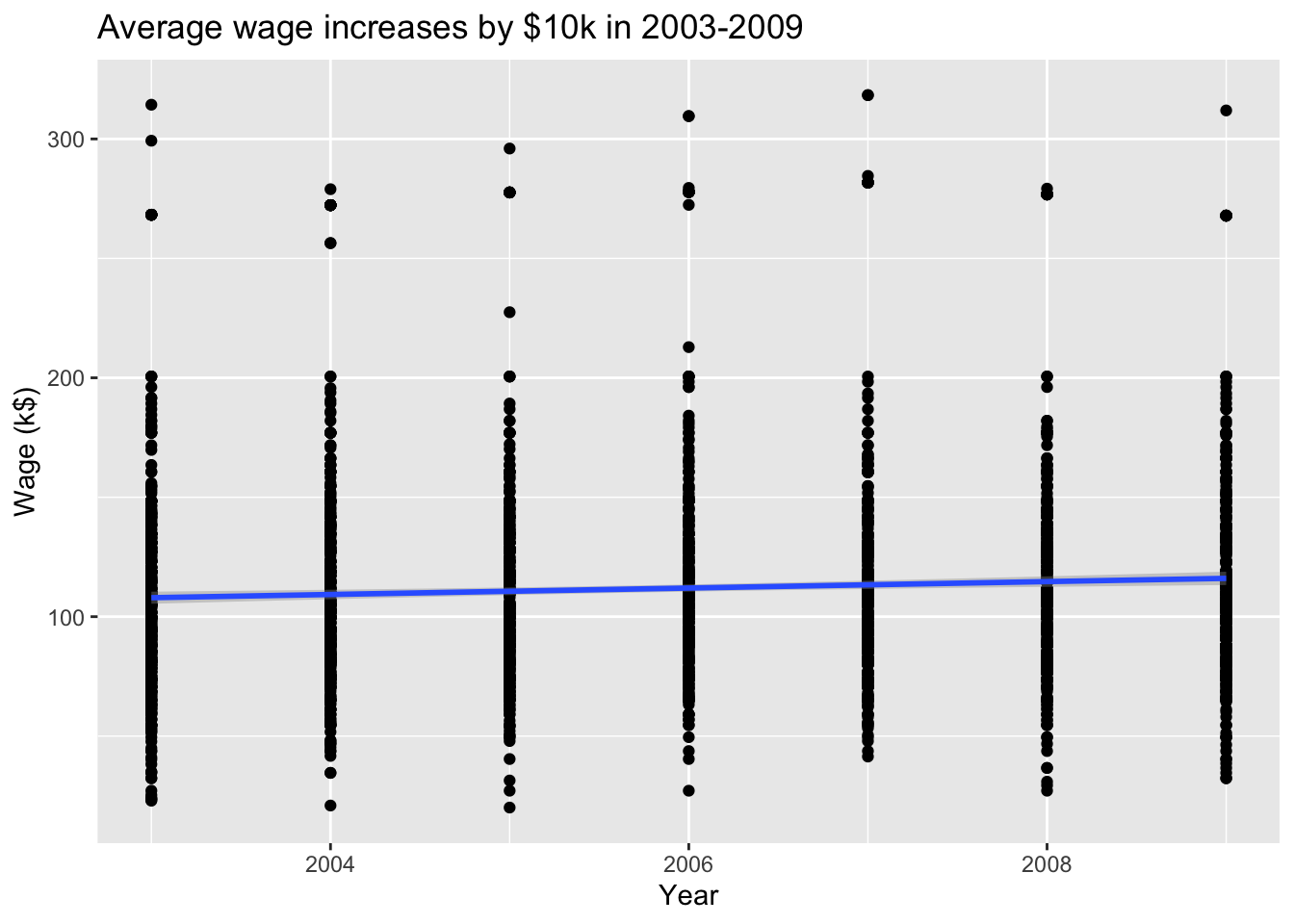
# Plot wage ~ yearsns.lmplot( data = Wage, x ="year", y ="wage", scatter_kws = {'alpha' : 0.1}, height =8 ).set( xlabel ='Year', ylabel ='Wage (k$)' )
Figure 2: Average wage increases by $10k in 2003-2009.
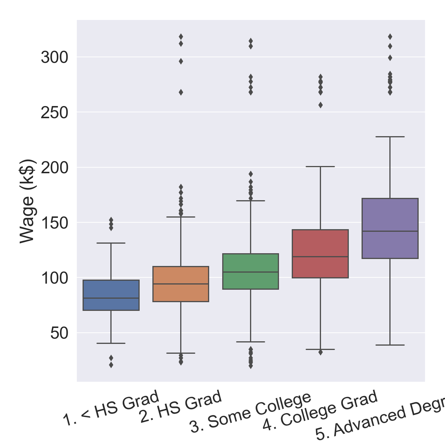
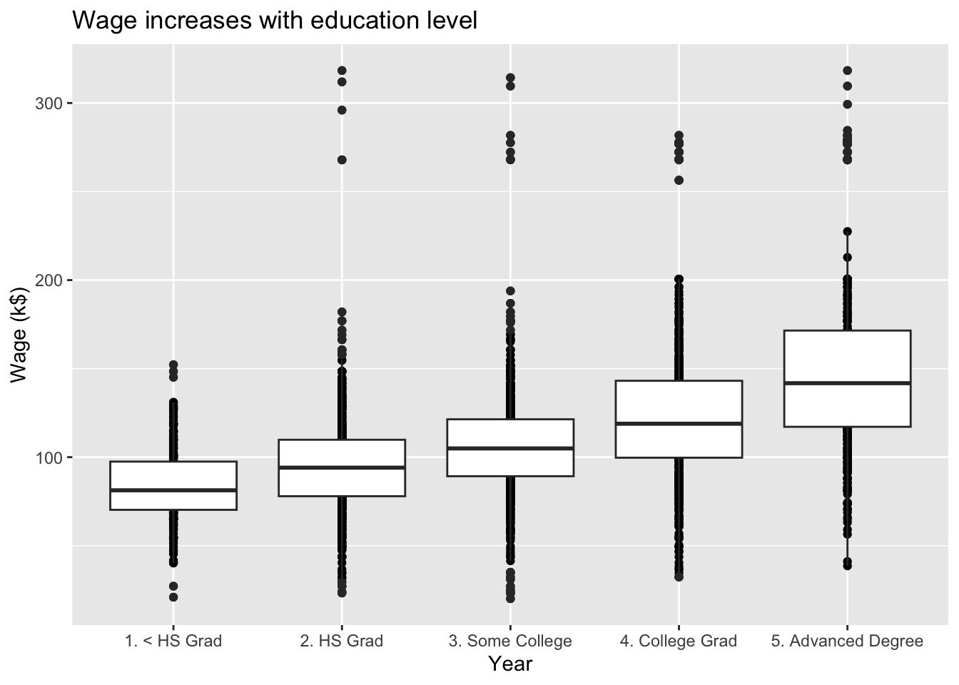
# Plot wage ~ educationax = sns.boxplot( data = Wage, x ="education", y ="wage" )ax.set( xlabel ='Education', ylabel ='Wage (k$)' )ax.set_xticklabels(ax.get_xticklabels(), rotation =15)
Figure 3: Wage increases with education level.
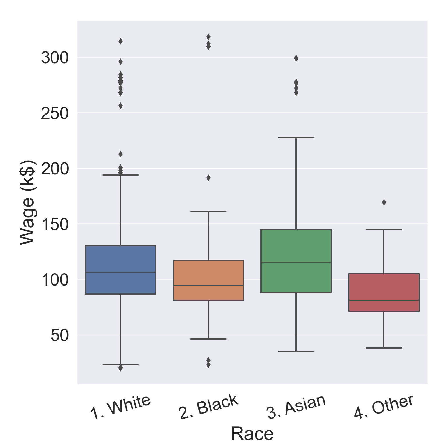
# Plot wage ~ raceax = sns.boxplot( data = Wage, x ="race", y ="wage" )ax.set( xlabel ='Race', ylabel ='Wage (k$)' )ax.set_xticklabels(ax.get_xticklabels(), rotation =15)
Figure 4: Any income inequality?
library(gtsummary)library(ISLR2)library(tidyverse)# Convert to tibbleWage <-as_tibble(Wage) %>%print(width =Inf)
# A tibble: 3,000 × 11
    year   age maritl           race     education       region
   <int> <int> <fct>            <fct>    <fct>           <fct>
 1  2006    18 1. Never Married 1. White 1. < HS Grad    2. Middle Atlantic
 2  2004    24 1. Never Married 1. White 4. College Grad 2. Middle Atlantic
 3  2003    45 2. Married       1. White 3. Some College 2. Middle Atlantic
 4  2003    43 2. Married       3. Asian 4. College Grad 2. Middle Atlantic
 5  2005    50 4. Divorced      1. White 2. HS Grad      2. Middle Atlantic
 6  2008    54 2. Married       1. White 4. College Grad 2. Middle Atlantic
 7  2009    44 2. Married       4. Other 3. Some College 2. Middle Atlantic
 8  2008    30 1. Never Married 3. Asian 3. Some College 2. Middle Atlantic
 9  2006    41 1. Never Married 2. Black 3. Some College 2. Middle Atlantic
10  2004    52 2. Married       1. White 2. HS Grad      2. Middle Atlantic
   jobclass       health         health_ins logwage  wage
   <fct>          <fct>          <fct>        <dbl> <dbl>
 1 1. Industrial  1. <=Good      2. No         4.32  75.0
 2 2. Information 2. >=Very Good 2. No         4.26  70.5
 3 1. Industrial  1. <=Good      1. Yes        4.88 131.
 4 2. Information 2. >=Very Good 1. Yes        5.04 155.
 5 2. Information 1. <=Good      1. Yes        4.32  75.0
 6 2. Information 2. >=Very Good 1. Yes        4.85 127.
 7 1. Industrial  2. >=Very Good 1. Yes        5.13 170.
 8 2. Information 1. <=Good      1. Yes        4.72 112.
 9 2. Information 2. >=Very Good 1. Yes        4.78 119.
10 2. Information 2. >=Very Good 1. Yes        4.86 129.
# … with 2,990 more rows
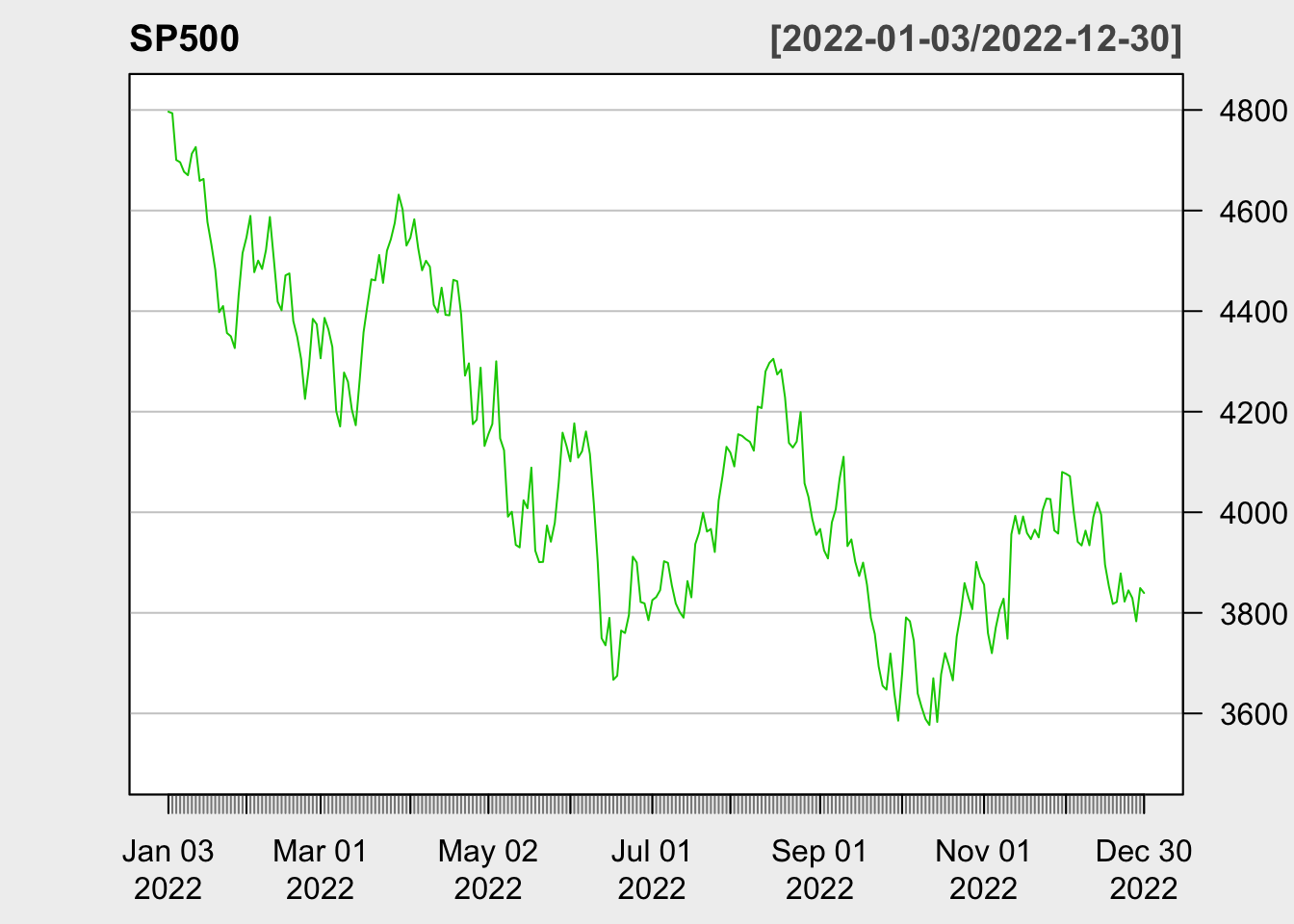
library(quantmod)SP500 <-getSymbols("^GSPC", src ="yahoo", auto.assign =FALSE, from ="2022-01-01",to ="2022-12-31")chartSeries(SP500, theme =chartTheme("white"),type ="line", log.scale =FALSE, TA =NULL)
The Smarket data set contains daily percentage returns for the S&P 500 stock index between 2001 and 2005.
Our goal is to predict whether the index will increase or decrease on a given day, using the past 5 days’ percentage changes in the index.
Since the outcome is binary (increase or decrease), it is a classification problem.
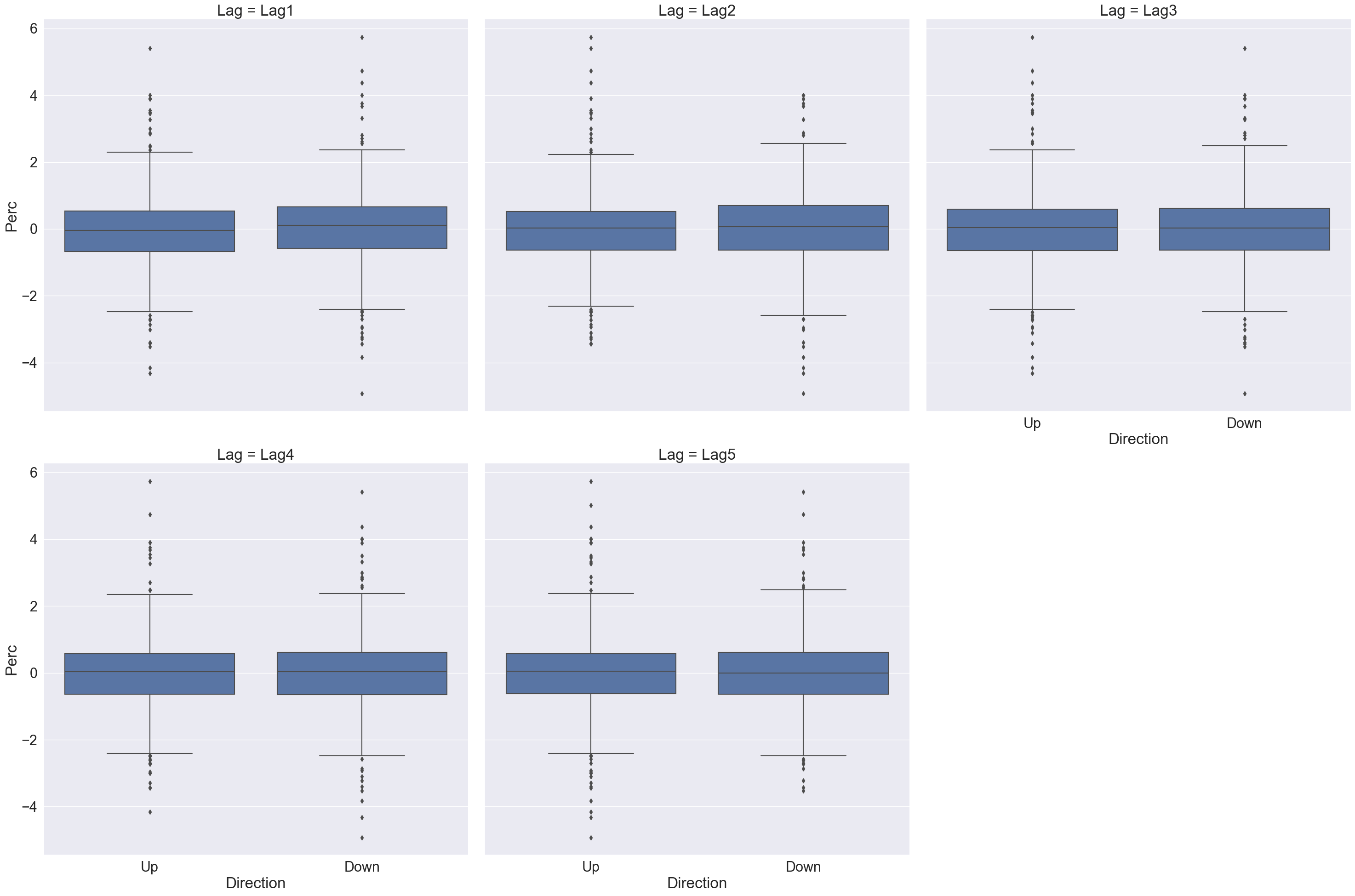
From the boxplots in Figure 5, it seems that the previous 5 days percentage returns do not discriminate whether today’s return is positive or negative.
# Pivot to long format for facet plottingSmarket_long = pd.melt( Smarket, id_vars = ['Year', 'Volume', 'Today', 'Direction'], value_vars = ['Lag1', 'Lag2', 'Lag3', 'Lag4', 'Lag5'], var_name ='Lag', value_name ='Perc' )Smarket_long
      Year   Volume  Today Direction   Lag   Perc
0     2001  1.19130  0.959        Up  Lag1  0.381
1     2001  1.29650  1.032        Up  Lag1  0.959
2     2001  1.41120 -0.623      Down  Lag1  1.032
3     2001  1.27600  0.614        Up  Lag1 -0.623
4     2001  1.20570  0.213        Up  Lag1  0.614
...    ...      ...    ...       ...   ...    ...
6245  2005  1.88850  0.043        Up  Lag5 -0.285
6246  2005  1.28581 -0.955      Down  Lag5 -0.584
6247  2005  1.54047  0.130        Up  Lag5 -0.024
6248  2005  1.42236 -0.298      Down  Lag5  0.252
6249  2005  1.38254 -0.489      Down  Lag5  0.422

[6250 rows x 6 columns]
g = sns.FacetGrid(Smarket_long, col ="Lag", col_wrap =3, height =10)g.map_dataframe(sns.boxplot, x ="Direction", y ="Perc")
Figure 5: LagX is the percentage return for the previous X days.
plt.clf()
# Data informationhelp(Smarket)# Convert to tibbleSmarket <-as_tibble(Smarket) %>%print(width =Inf)
# A tibble: 1,250 × 9
    Year   Lag1   Lag2   Lag3   Lag4   Lag5 Volume  Today Direction
   <dbl>  <dbl>  <dbl>  <dbl>  <dbl>  <dbl>  <dbl>  <dbl> <fct>
 1  2001  0.381 -0.192 -2.62  -1.06   5.01    1.19  0.959 Up
 2  2001  0.959  0.381 -0.192 -2.62  -1.06    1.30  1.03  Up
 3  2001  1.03   0.959  0.381 -0.192 -2.62    1.41 -0.623 Down
 4  2001 -0.623  1.03   0.959  0.381 -0.192   1.28  0.614 Up
 5  2001  0.614 -0.623  1.03   0.959  0.381   1.21  0.213 Up
 6  2001  0.213  0.614 -0.623  1.03   0.959   1.35  1.39  Up
 7  2001  1.39   0.213  0.614 -0.623  1.03    1.44 -0.403 Down
 8  2001 -0.403  1.39   0.213  0.614 -0.623   1.41  0.027 Up
 9  2001  0.027 -0.403  1.39   0.213  0.614   1.16  1.30  Up
10  2001  1.30   0.027 -0.403  1.39   0.213   1.23  0.287 Up
# … with 1,240 more rows
# Summary statisticssummary(Smarket)
      Year           Lag1                Lag2                Lag3
 Min.   :2001   Min.   :-4.922000   Min.   :-4.922000   Min.   :-4.922000
 1st Qu.:2002   1st Qu.:-0.639500   1st Qu.:-0.639500   1st Qu.:-0.640000
 Median :2003   Median : 0.039000   Median : 0.039000   Median : 0.038500
 Mean   :2003   Mean   : 0.003834   Mean   : 0.003919   Mean   : 0.001716
 3rd Qu.:2004   3rd Qu.: 0.596750   3rd Qu.: 0.596750   3rd Qu.: 0.596750
 Max.   :2005   Max.   : 5.733000   Max.   : 5.733000   Max.   : 5.733000
      Lag4                Lag5              Volume           Today
 Min.   :-4.922000   Min.   :-4.92200   Min.   :0.3561   Min.   :-4.922000
 1st Qu.:-0.640000   1st Qu.:-0.64000   1st Qu.:1.2574   1st Qu.:-0.639500
 Median : 0.038500   Median : 0.03850   Median :1.4229   Median : 0.038500
 Mean   : 0.001636   Mean   : 0.00561   Mean   :1.4783   Mean   : 0.003138
 3rd Qu.: 0.596750   3rd Qu.: 0.59700   3rd Qu.:1.6417   3rd Qu.: 0.596750
 Max.   : 5.733000   Max.   : 5.73300   Max.   :3.1525   Max.   : 5.733000
 Direction
 Down:602
 Up  :648
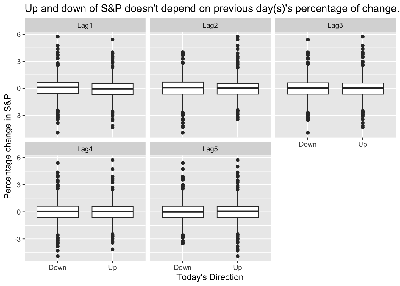
# Plot Direction ~ Lag1, Direction ~ Lag2, ...Smarket %>%pivot_longer(cols = Lag1:Lag5, names_to ="Lag", values_to ="Perc") %>%ggplot() +geom_boxplot(mapping =aes(x = Direction, y = Perc)) +labs(x ="Today's Direction", y ="Percentage change in S&P",title ="Up and down of S&P doesn't depend on previous day(s)'s percentage of change." ) +facet_wrap(~ Lag)
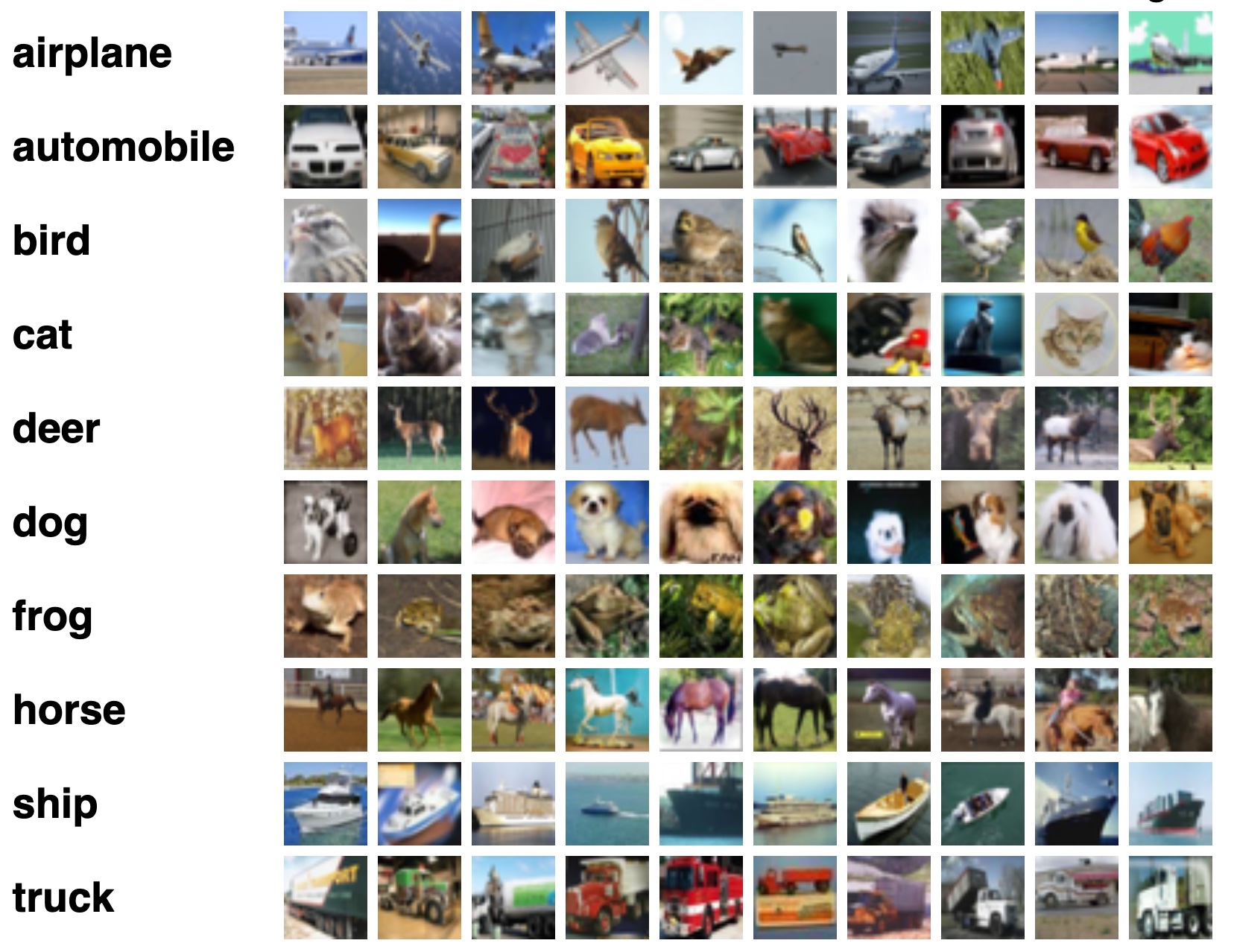
1.2.3 Example: handwritten digit recognition
Figure 6: Examples of handwritten digits from the MNIST corpus (ISL Figure 10.3).
1.2.5 Example: classify the pixels in a satellite image, by usage
Figure 7: LANDSET images (ESL Figure 13.6).
LANDSAT: 82x100 pixels. Four heat-map images, two in the visible spectrum and two in the infrared, for an area of agricultural land in Australia.
Each pixel has a class label from the 7-element set {red soil, cotton, vegetation stubble, mixture, gray soil, damp gray soil, very damp gray soil}, determined manually by research assistants surveying the area. The objective is to classify the land usage at a pixel, based on the information in the four spectral bands.
1.3 Unsupervised learning
No outcome variable, just predictors.
Objective is more fuzzy: find groups that behave similarly, find features that behave similarly, find linear combinations of features with the most variations, generative models (transformers).
Difficult to know how well you are doing.
Can be useful in exploratory data analysis (EDA) or as a pre-processing step for supervised learning.
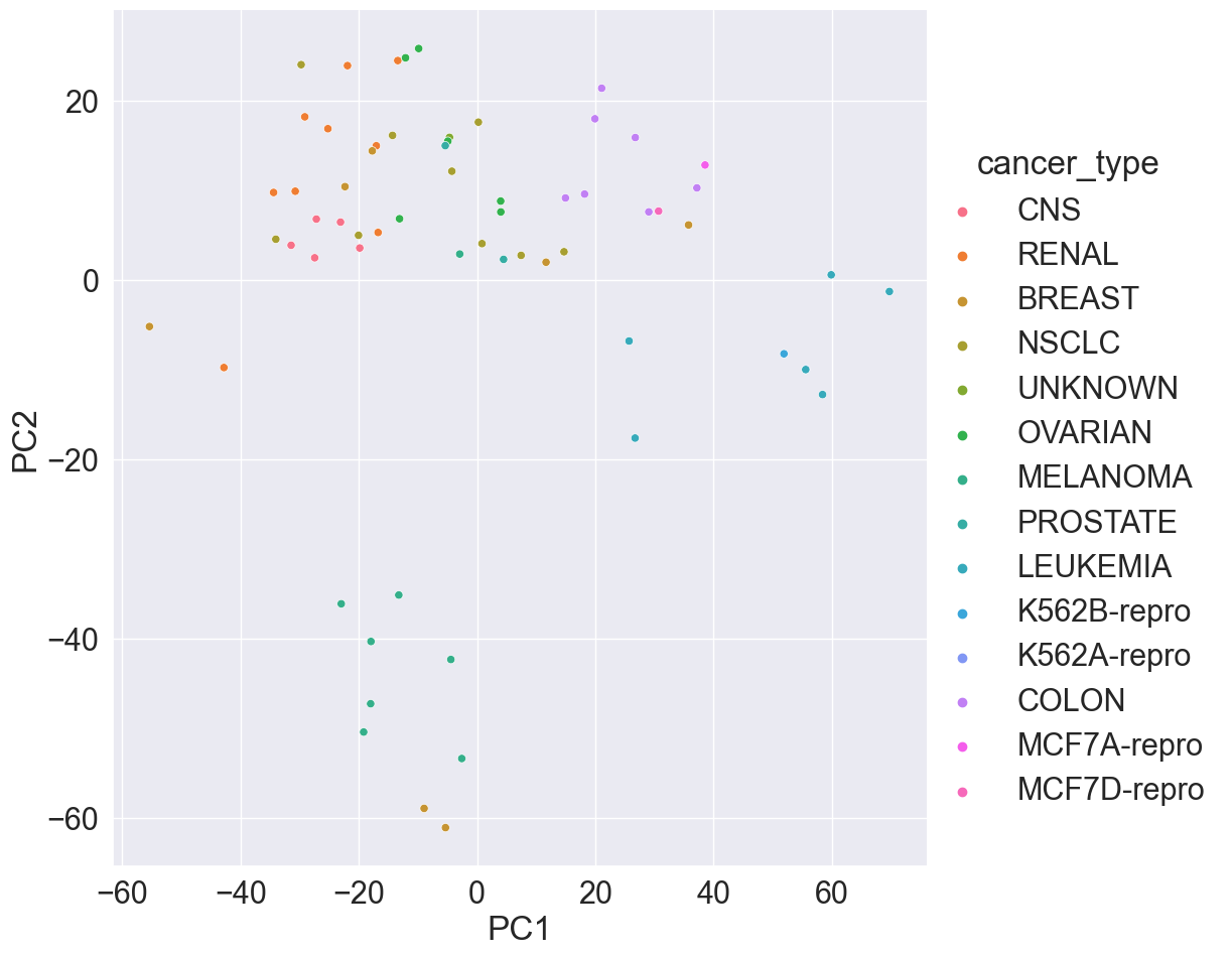
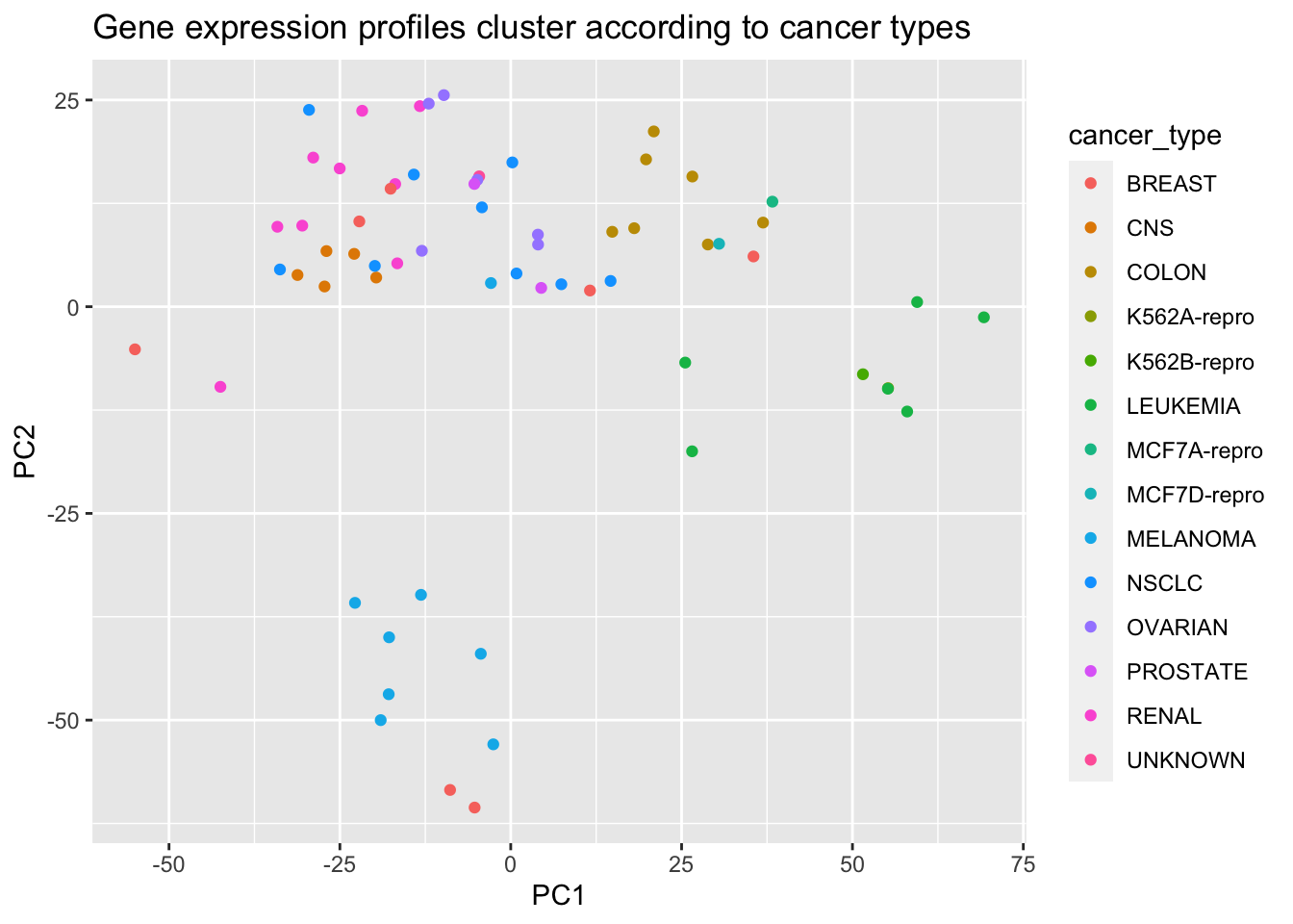
1.3.1 Example: gene expression
The NCI60 data set consists of 6,830 gene expression measurements for each of 64 cancer cell lines.
# Apply PCA using prcomp function# Need to scale / Normalize as# PCA depends on distance measureprcomp(NCI60$data, scale =TRUE, center =TRUE, retx = T)$x %>%as_tibble() %>%add_column(cancer_type = NCI60$labs) %>%# Plot PC2 vs PC1ggplot() +geom_point(mapping =aes(x = PC1, y = PC2, color = cancer_type)) +labs(title ="Gene expression profiles cluster according to cancer types")
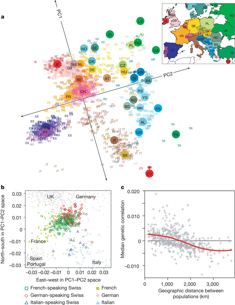
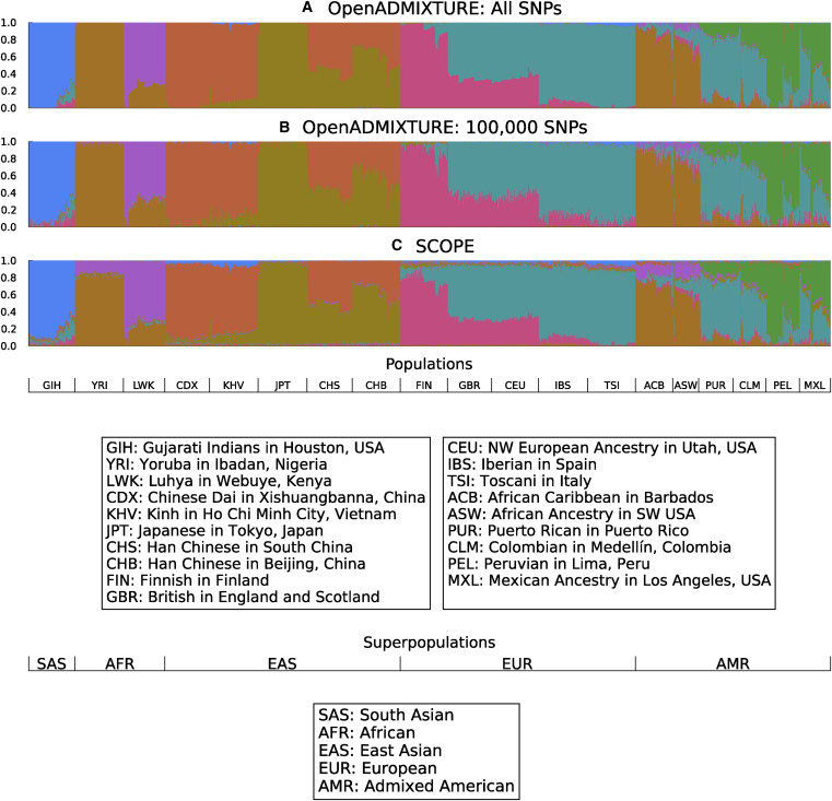
1.3.2 Example: mapping people from their genomes
The genetic makeup of \(n\) individuals can be represented by a matrix Equation 1, where \(x_{ij} \in \{0, 1, 2\}\) is the \(j\)-th genetic marker of the \(i\)-th individual.
Is that possible to visualize the geographic relationship of these individuals?
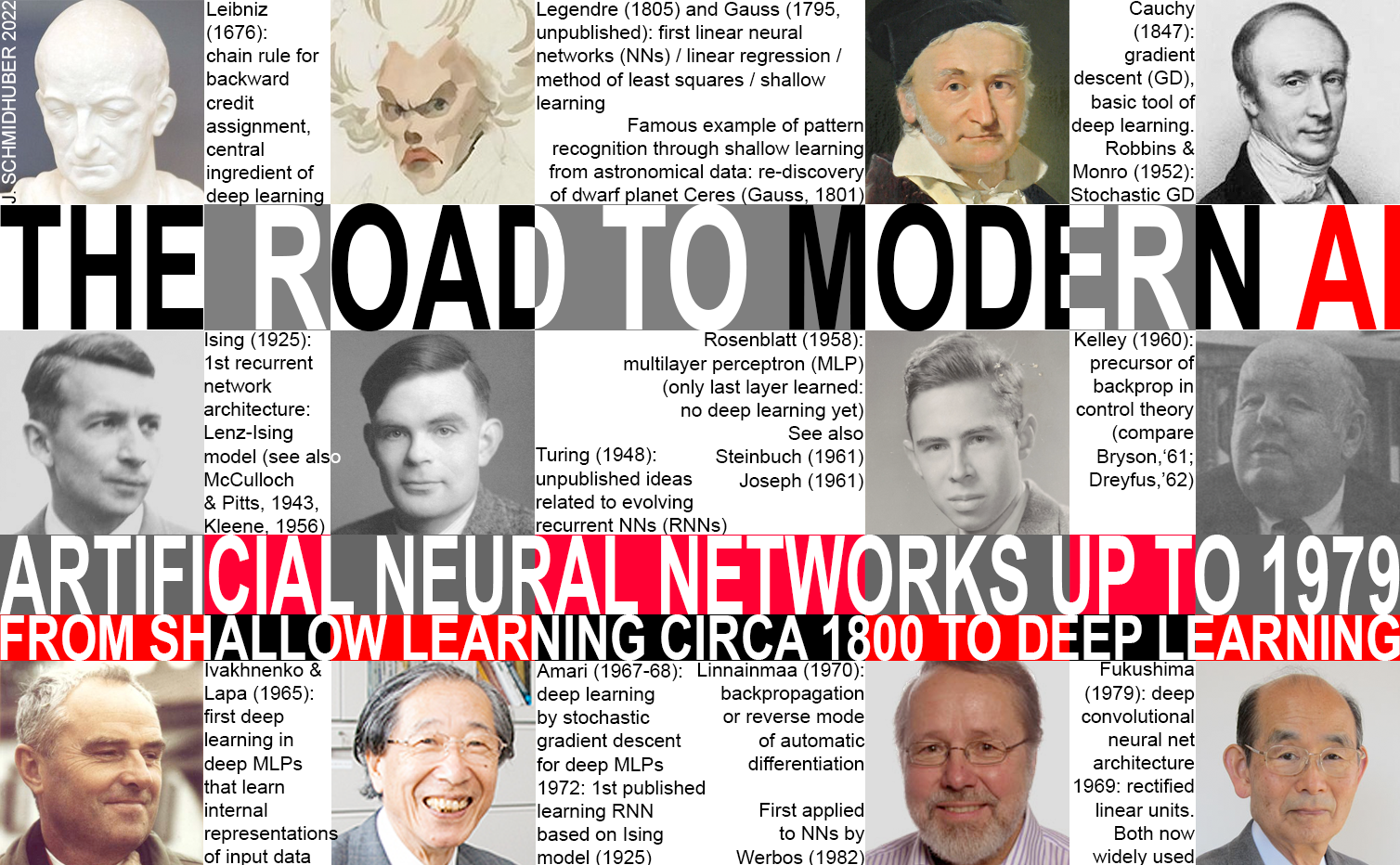
1805, least squares / linear regression / shallow learning by Gauss.
1936, classification by linear discriminant analysis by Fisher.
1940s, logistic regression.
Early 1970s, generalized linear models (GLMs).
Mid 1980s, classification and regression trees.
1980s, generalized additive models (GAMs).
1980s, neural networks gained popularity.
1990s, support vector machines.
2010s, deep learning.
2 Course logistics
2.1 Learning objectives
Understand what machine learning is (and isn’t).
Learn some foundational methods/tools.
For specific data problems, be able to choose methods that make sense.
Tip
Q: Wait, Dr. Zhou! Why don’t we just learn the best method (aka deep learning) first?
A: No single method dominates. One method may prove useful in answering some questions on a given data set. On a related (not identical) data set or question, another might prevail. Article
2.2 Syllabus
Read syllabus and schedule for a tentative list of topics and course logistics.
Homework assignments will be a mix of theoretical/conceptual and applied/computational questions. Although not required, you are highly encouraged to practice literate programming (using Jupyter, Quarto, RMarkdown, or Google Colab) coordinated through Git/GitHub. This will enhance your GitHub profile and make you more appealing on job market.
We will use Python in this course. Limited support for R and Julia is also available from Dr. Hua Zhou.
2.3 What I expect from you
You are curious and are excited about “figuring stuff out”.
You are proficient in coding and debugging (or are ready to work to get there).
You have a solid foundation in introductory statistics (or are ready to work to get there).
You are willing to ask questions.
2.4 What you can expect from me
I value your learning experience and process.
I’m flexible with respect to the topics we cover.
I’m happy to share my professional connections.
I’ll try my best to be responsive in class, in office hours, and on Slack.